CSS Grid is used to arrange elements on the webpage, sometimes developers make the whole website layout using Grids! Let's learn how we can use CSS Grids to make fancy layouts that are also mobile responsive!
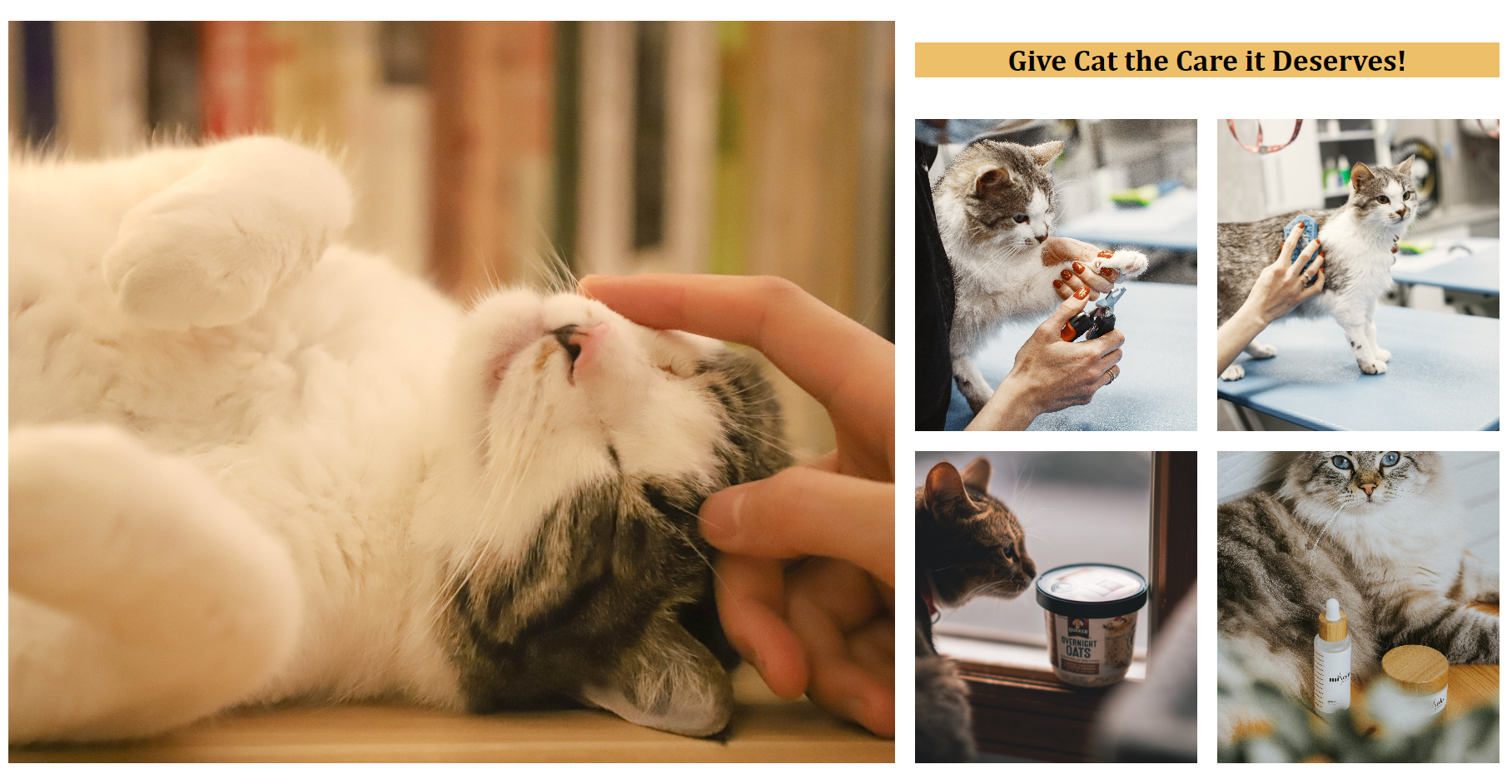
We will create the layout as in the blog's thumbnail, and while doing so, we'll learn Grid's different properties and how we can use them for a real-world scenario.
First let's find out how many elements we have, and how we plan to arrange them. I created this rough sketch in Figma to find out how many rows and columns we need.
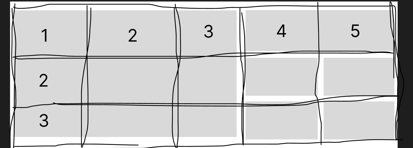
So the plan is to create 5 columns and 3 rows. Let's first place the elements on the screen and then we'll find out how we can arrange the elements.
<body>
  <section class="hero">
    <img src="./assets/cat-hero.jpg" id="cat-hero" alt="cat-hero-section">
    <h1>Give Cat the Care it Deserves!</h1>
    <img src="./assets/cat-nails.jpg" class="square-img" alt="">
    <img src="./assets/cat-brush.jpg" class="square-img" alt="">
    <img src="./assets/cat-food.jpg" class="square-img" alt="">
    <img src="./assets/cat-product.jpg" class="square-img" alt="">
  </section>
</body>
We have all the elements on the screen, but they of course don't look good as we haven't touched the CSS. We will create a mobile-first design, so let's start!
In mobile, we just need one column and we want all the elements to go one after the other.
/* Extra CSS, not related to Grid */
* {
  margin: 0;
  padding: 0;
}

body {
  font-family: Cambria, Cochin, Georgia, Times, 'Times New Roman', serif;
}

section.hero {
  padding: 10px;
}
Okay now, let's jump on creating the structure of the website. We'll apply display: grid; to the section with class hero. And we want to give margins of 1em to each cell. We can also use margin, but we'll be using gap as it is more convenient and will take care of everything.
section.hero {
  display: grid;
  gap: 1em;
}
Let's write some more CSS to make it look good.
#cat-hero {
  width: 100%;
  height: 100%;
  object-fit: cover;
}

section.hero>h1 {
  text-align: center;
  align-self: center;
  background-color: #EDBF69;
}

.square-img {
  width: 100%;
  height: 250px;
  object-fit: cover;
}
Till now we haven't used anything fancy, with the above code, we got a layout where the things are one after the other.
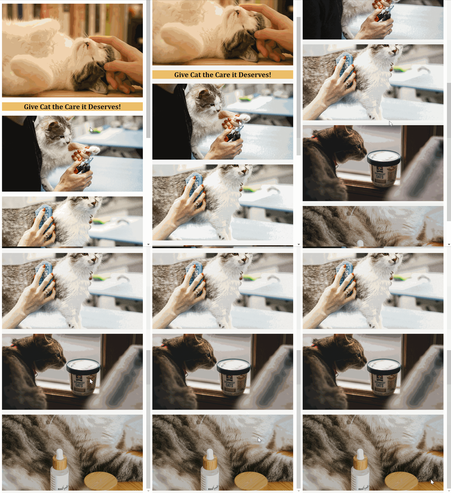
Okay, now mobile is done, let's figure out how we can make the layout like the thumbnail.
So we can see we have 5 columns and 3 rows, and while looking closely at the end result, we can observe that the first row is smaller than the second and third rows.
To define a number of columns and rows we have a property called grid-template-columns and grid-template-rows. Let's use it inside media query to make out website responsive.
@media screen and (min-width: 800px) {
  section.hero {
    grid-template-columns: repeat(5, 1fr);
    grid-template-rows: 0.3fr 1fr 1fr;
  }
}
Notice we used a unit called fr, it is a special unit that automatically calculates the available space. So this line grid-template-columns: repeat(5, 1fr); means that give me 5 columns of 1fr each another way of saying the same is, give me 5 equal columns.
And this line grid-template-rows: 0.3fr 1fr 1fr; means give me 3 rows and the first row should be one-third of the second and the third row.
Let's see what we got now.
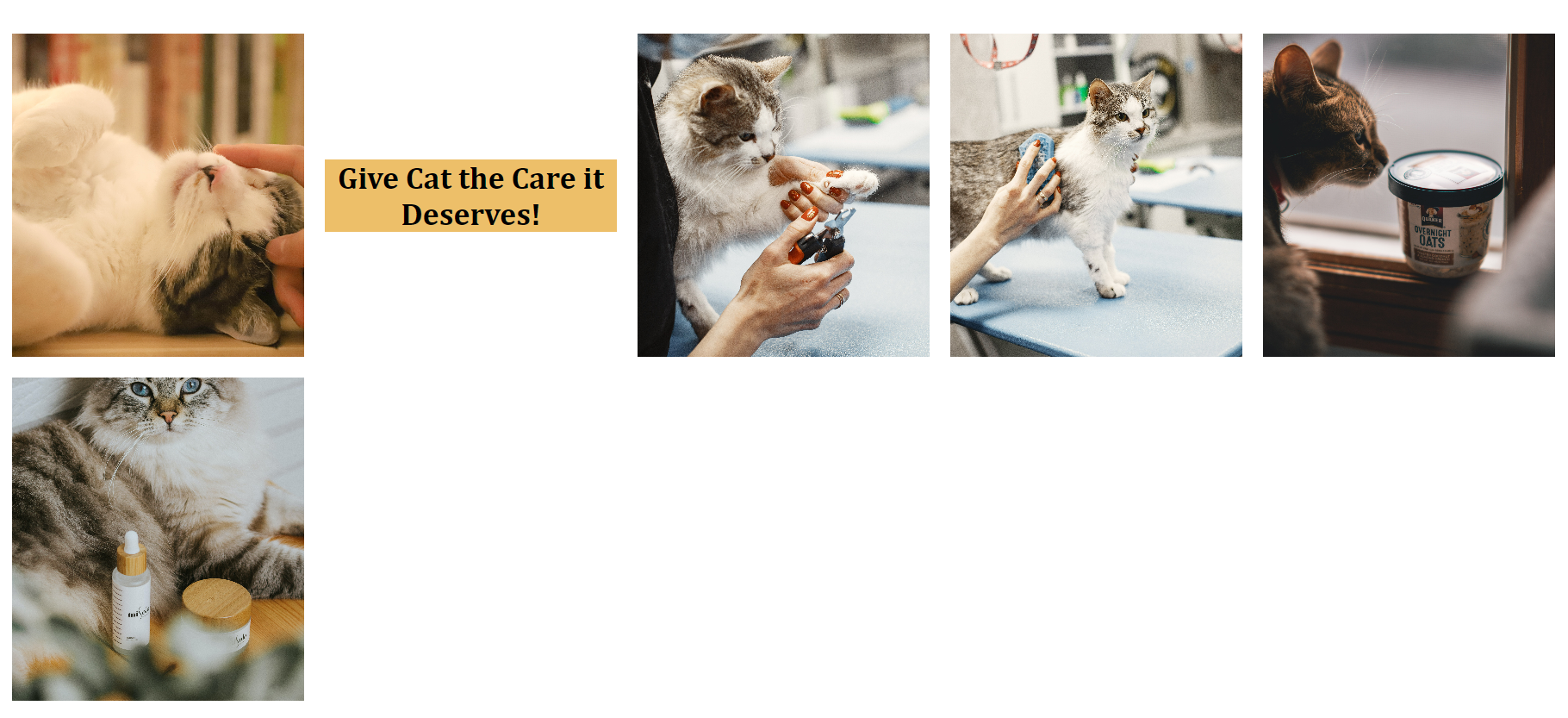
Okay, It looks decent, but still not what we wanted. As we could see the first cat image should take the first three columns and all the three rows. And our h1 should take 2 columns. There are multiple ways for achieving the same, but the easiest and the best way is through span inside grid-column / grid-row. We have to define how much row or column that particular element should span upon.
  section.hero>h1 {
    grid-column: span 2;
  }

  #cat-hero {
    grid-column: span 3;
    grid-row: span 3;
  }
We got what we wanted. This is the final result.
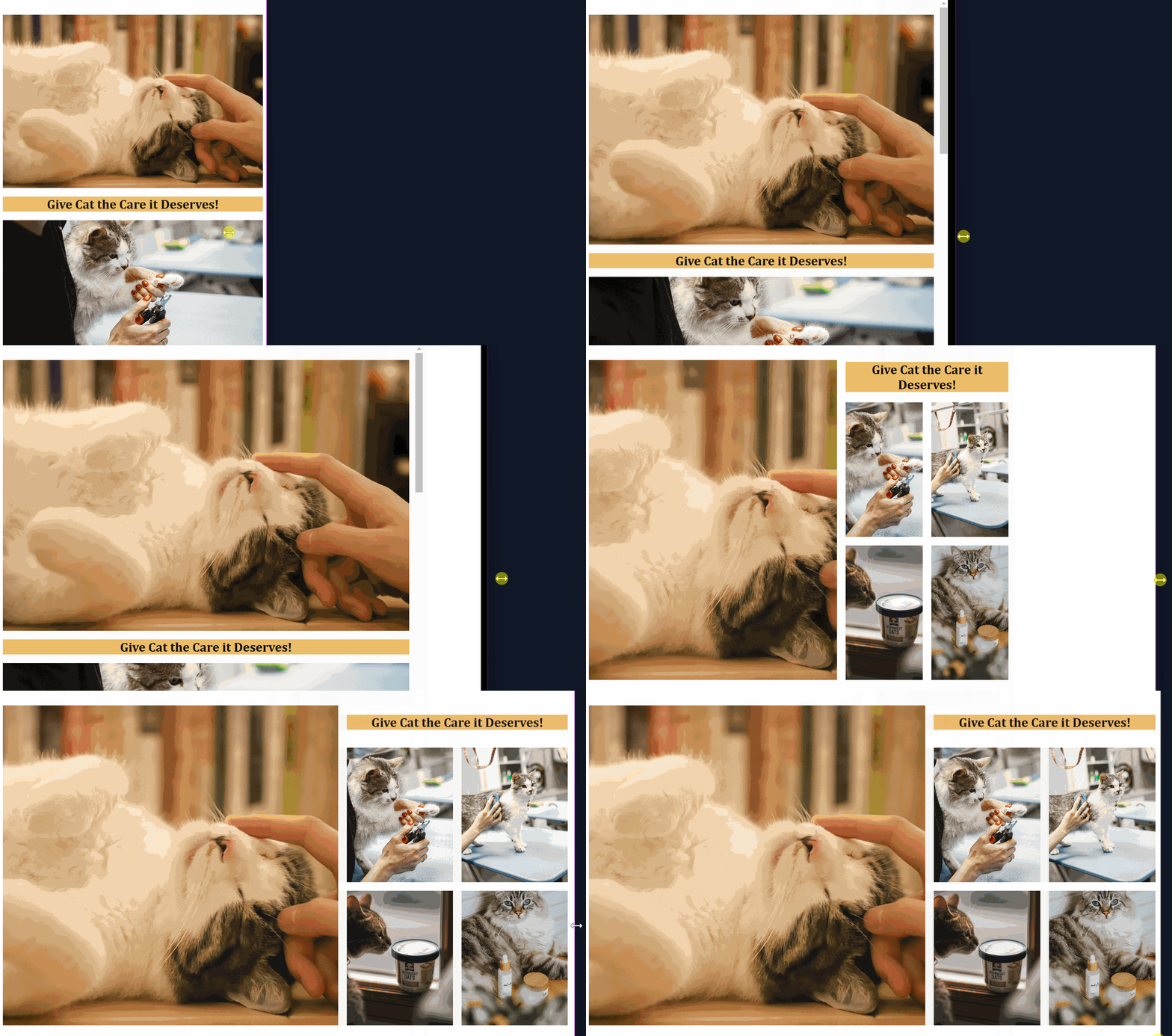
I hope this was helpful, if you want to play with the code you can check out the hosted code here.
Happy Learning ✨
About the author
🚀 Web Designer and learning full Stack Web development.
Comments
Join the discussionNo comments yet. Be the first to comment.
Web Designing
In this series, we'll together learn everything about web designing, tips and tricks to develop better UI.