A guide for understanding FlexBox ✨
🚀 Web Designer and learning full Stack Web development.
In this blog, we'll discuss arguably one of the most important concepts of CSS and how it can help us to style our website!
Let's flex:

NavBar
A navBar is a prominent place where we use flexbox. With flexbox, we can easily place nav items right next to each other.
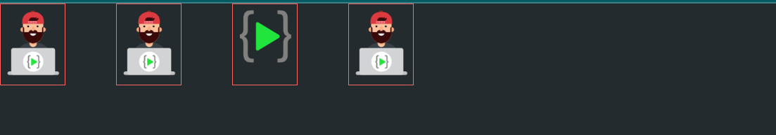
Let's say we have a list which has 5 elements, and we want to place it like a nav bar.
<ul>
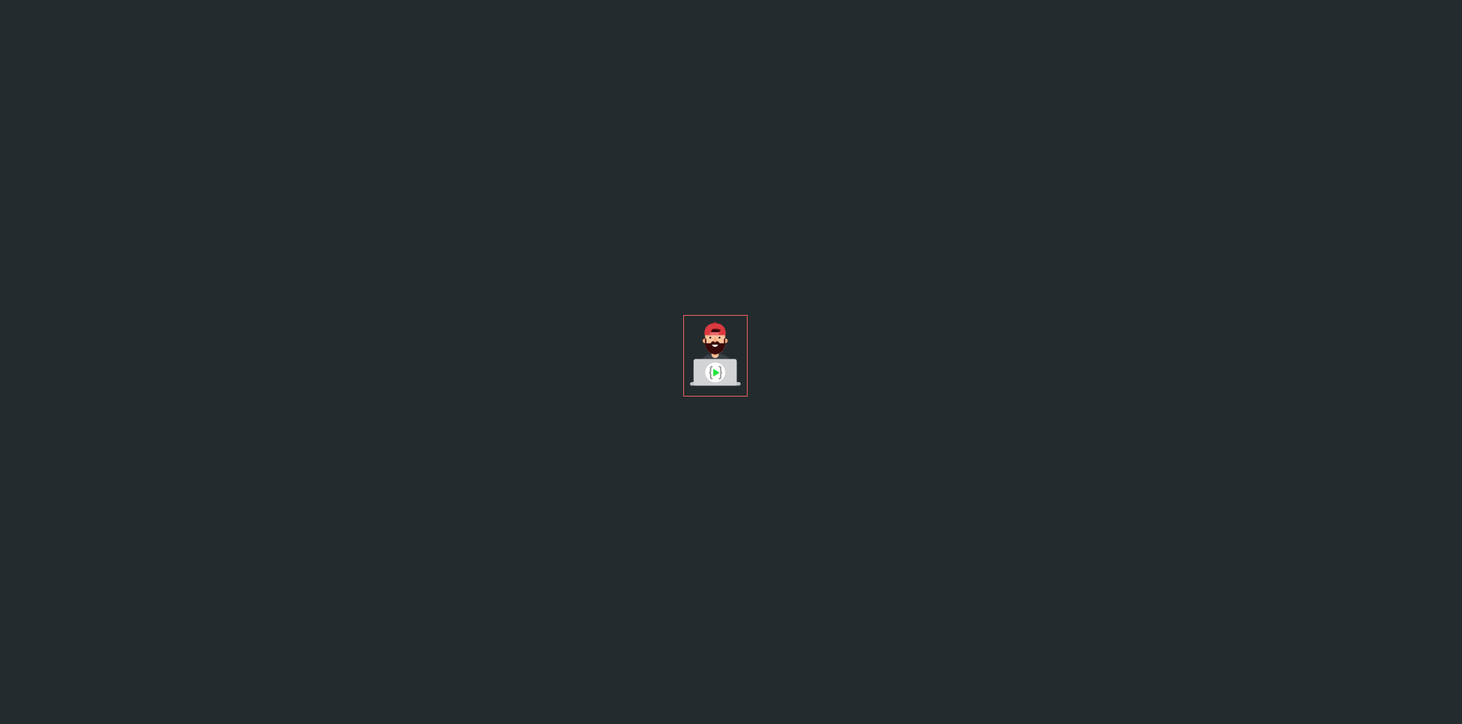
<li><img src="mascot.png" /></li>
<li><img src="mascot.png" /></li>
<li><img src="mascot.png" /></li>
<li><img src="mascot.png" /></li>
</ul>
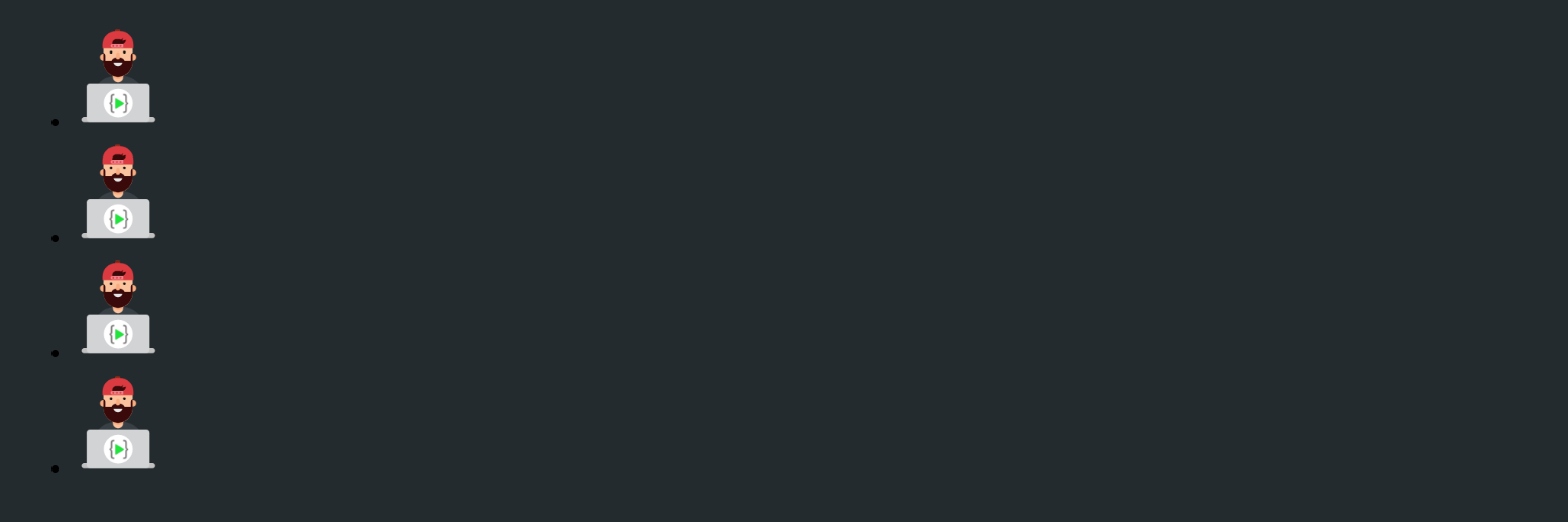
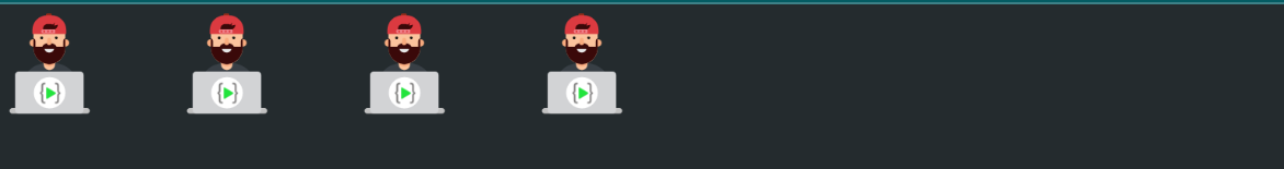
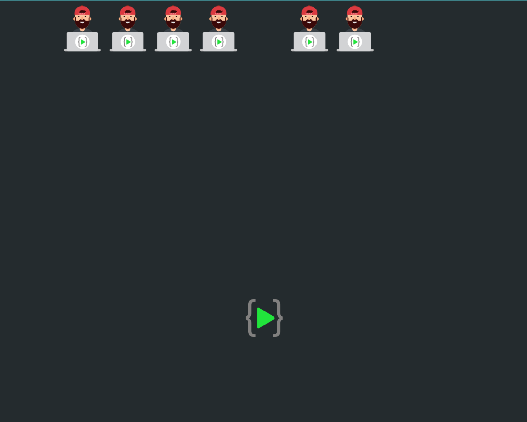
Doesn't looks like a nav right? Let's add a little bit of CSS and see how it turns out.
  ul {
    display: flex;
    list-style-type: none;
  }

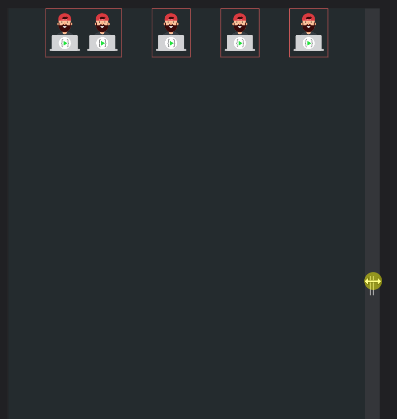
Already looking good! But they look stuck together, to give some space between elements we can use the gap property.
  ul {
    display: flex;
    list-style-type: none;
    gap: 3em;
  }
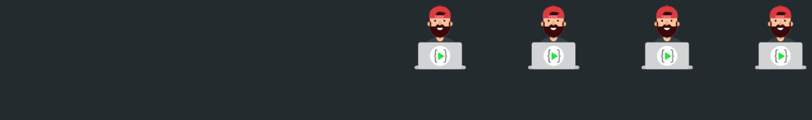
But sometimes you would want that the nav bar should be placed at the very right of the webpage, for this you can use justify-content.
  ul {
    display: flex;
    list-style-type: none;
    gap: 3em;
    justify-content: flex-end;
  }
or we can place it in the center.
 ul {
    display: flex;
    list-style-type: none;
    gap: 3em;
    justify-content: center;
  }

With justify-content, we are positioning elements on the main axis. Let's talk about the axis.
So there are broadly two ways (you will later see that it is untrue) to position elements on a webpage, one would be from left to right (row) and from top to bottom (column). Let's understand.
Let's see what if we change the flex-direction property to row.
  ul {
    display: flex;
    flex-direction: row;
    list-style-type: none;
    gap: 3em;
  }
Hmm... nothing changed right? Yes, that's because by default the flex will arrange elements in a row! What if we try to change flex-direction to column? Let's find out.
  ul {
    display: flex;
    flex-direction: column;
    list-style-type: none;
    gap: 3em;
  }
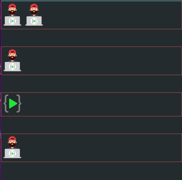
Now let's take a step back and understand how flex actually works.
Let's say we have li, and as we know they are block-level elements which means they stack on top of each other and they stretch and take up all the available space. And as soon as we apply display: flex;, they are no longer block-level elements, these items are now flex elements/items and they'll behave like a flex item.
Properties of flex item:
- It wraps the item to its max-content (if space is available)
- Maintains everything on one line
- If it runs out of space, it is allowed to wrap the content.
Let's understand with an example
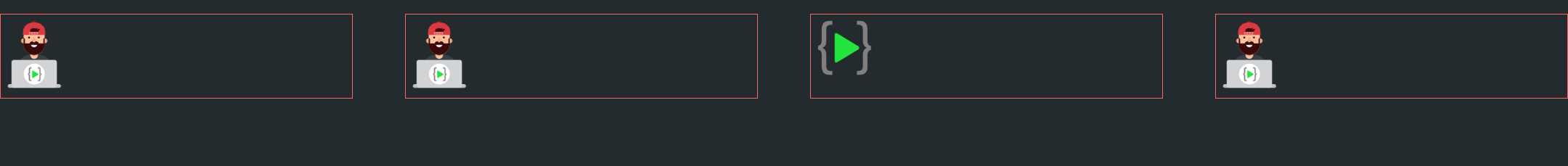
<ul>
    <li><img src="mascot.png" /><img src="mascot.png" /></li>
    <li><img src="mascot.png" /></li>
    <li><img src="mascot.png" /></li>
    <li><img src="mascot.png" /></li>
  </ul>
Now we have two img in the same li, when it had space, it tries to place the images one after the other (on the same line), but as soon as it ran out of space, it wrapped and shifted the second image to the next line.
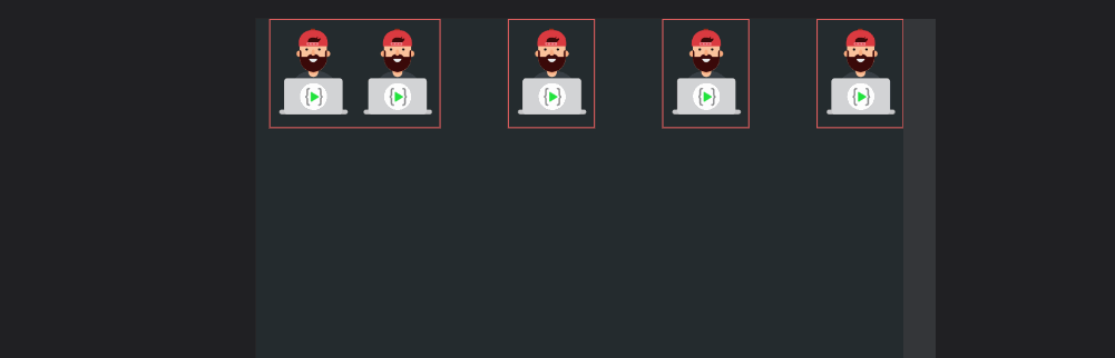
But if you don't want this behaviour, and you want your elements to stay on the same line and don't shrink, then there is a property named flex-shrink, which can be used on the flex items to specify if we want this wrapping behaviour, by default, it is enabled (and has a value of 1), but we can easily disable it like below.
  li {
    border: 1px solid #FF6666;
    flex-shrink: 0;
  }
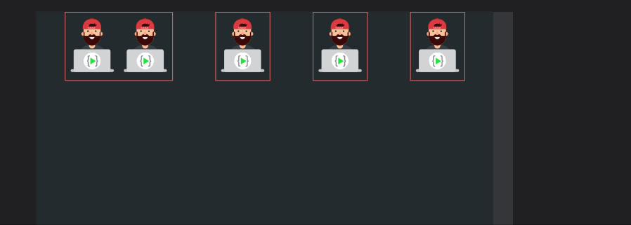
But as you can see above, the elements are overflowing, to avoid this issue, we have flex-wrap, we can apply it to the parent and the elements will start to wrap! The default value for flex-wrap is no-wrap.
  ul {
    display: flex;
    list-style-type: none;
    gap: 3em;
    justify-content: center;
    flex-wrap: wrap;
  }
We have one more interesting property in flex called flex-grow, as of now when we apply display flex, it tries to take the maximum content width and not the maximum available width. We can fix it with flex-grow.
  ul li {
    flex-grow: 1;
  }
Sometimes we just need a particular element to take more width and other elements to take less width, in those cases, we can apply flex-grow to that particular element only.
  #lco-logo {
    flex-grow: 1;
  }

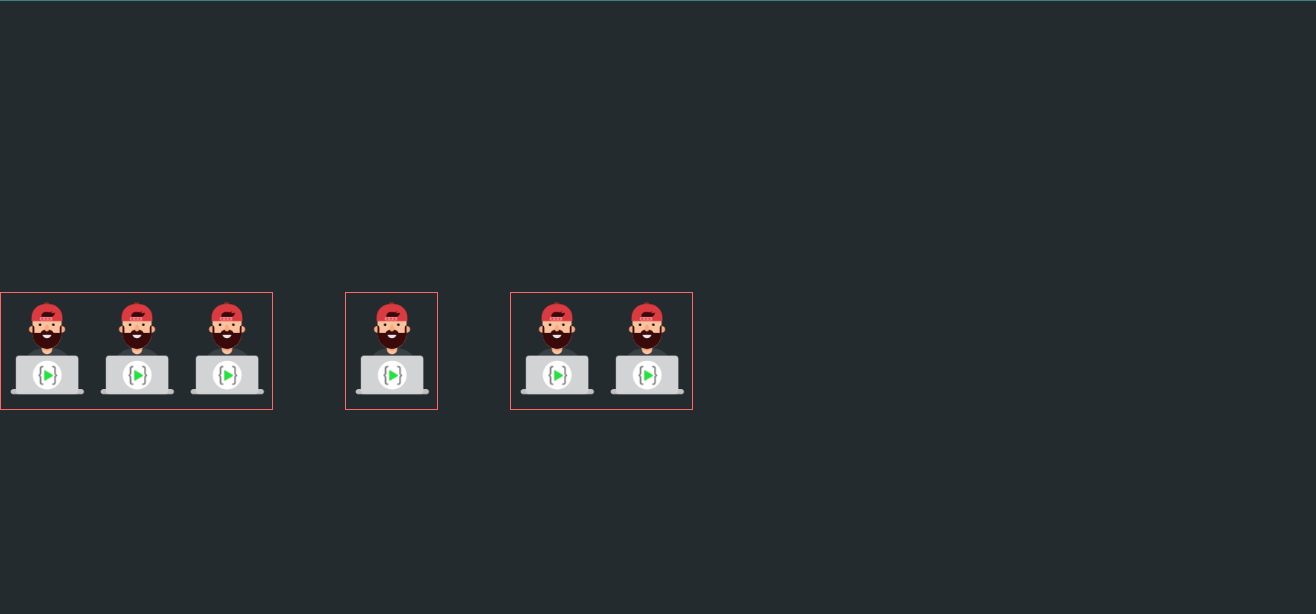
Before moving to the other axis, there is one more thing which we'll often use with flex. Let's say we have flex elements of different sizes, and we want to create columns of the same width for them to make them look good.
Let's say we have the below setup, one column has three images, the next has one and the last one has two images.
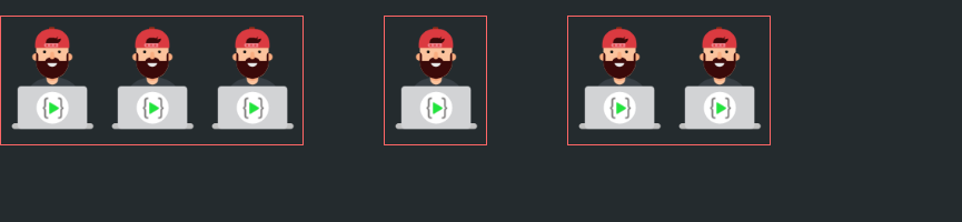
It looks like this, but if we want them to take the same width, we can use a small trick.
  ul>* {
    width: 100%;
    /* flex: 1; */
  }

Moving on, we have seen if we are working with the main axis we use justify-content, but to work with another axis, we have align-items, with align-items, we align the flex elements on the secondary axis (given there is space on another axis).
Let's create space on another axis and instead of telling you what will happen, see it by yourself.
  ul {
    height: 20vh;
    align-self: flex-end;

}
Okay, now let's see how the most difficult thing to do can be done with ease with the help of flex-box which is centring the elements on the screen.
  ul {
    height: 100vh;
    display: flex;
    list-style-type: none;
    justify-content: center;
    align-items: center;
  }
We are using justify-content to center the element on the main axis which in this case is left to right, and then we used align-items to center the item on the other axis which in this case is top to bottom. The important thing to note here is, that there should be space on another axis for align-items to work. That's the reason we gave the ul a height.
One last thing before we wrap up, we can also align a particular flex item on both the main axis and the other axis. Let's take an example with another axis.
  #lco-logo {
    align-self: center;
  }
That's all for now from me, if you want to practice using flex, there is a game called flex froggy. You can check that out and practice flexbox.
Happy Learning! ✨