CSS Positioning 1O1 (with use cases ✨)
Learn the tools required to structure your website the way you want!

🚀 Web Designer and learning full Stack Web development.
Who wants these kinds of websites in 2022?
No one right! The main issue with this website is that they are sticking to the "Normal document flow" or the default positioning of the elements, which makes it look... Umm... Naah... not so pleasing and of course, there are some issues with the styling... and graphics... but let's stick to the positioning for the scope of this blog!
Keep reading to get positioning examples and use-cases to use in your next website!
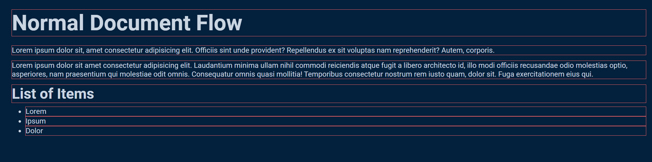
I mentioned above a term called the "Normal document flow", which just means how the "things" are positioned on our webpage or what is the flow of elements on our webpage before applying any kind of positioning on them. Observe the below code.
<body>
  <h1>Normal Document Flow</h2>
    <p>Lorem ipsum dolor sit, amet consectetur adipisicing elit. Officiis sint unde provident? Repellendus ex sit
      voluptas
      nam reprehenderit? Autem, corporis.</p>
    <p>Lorem ipsum dolor sit amet consectetur adipisicing elit. Laudantium minima ullam nihil commodi reiciendis atque
      fugit a libero architecto id, illo modi officiis recusandae odio molestias optio, asperiores, nam praesentium qui
      molestiae odit omnis. Consequatur omnis quasi mollitia! Temporibus consectetur nostrum rem iusto quam, dolor sit.
      Fuga exercitationem eius qui.</p>
    <h2>List of Items</h2>
    <ul>
      <li>Lorem</li>
      <li>Ipsum</li>
      <li>Dolor</li>
    </ul>
</body>
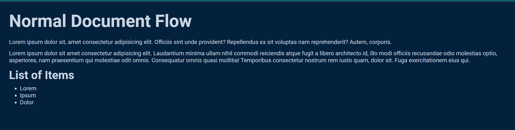
You must have guessed already that the elements we write in our HTML file will get displayed on the webpage from top to bottom (or in some cases left to right) if no position property is applied to it. This is Normal Document Flow. That's the default structure. That's what comes out of the box📦.
This box reminds me of our next topic 💡, with which you would understand the nature of our HTML elements
The Box Model
It is just a box that wraps around every HTML element. Now if we have a box around our elements, we can use properties like margins, borders, width, height and padding (okay... almost every).
The image below illustrates the box model:
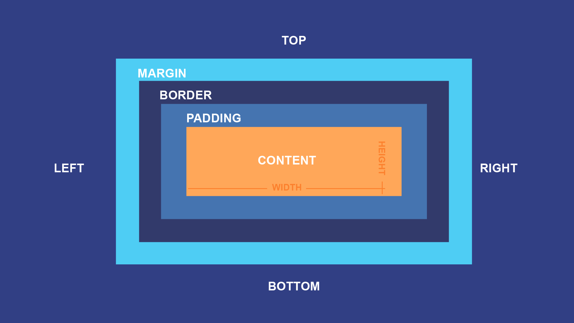
Every block level element we put on the screen is a box, it has some content, comes with height and width, margin and padding and a border.
What is block level?
Everything that takes the whole width of the screen (or its parent element) is a block-level element eg. <div>, <p>, <nav>, <h[i]> etc...
I don't trust you! Prove it to me
Here you go, I just added borders to the elements.
border: 1px solid #FF6666;
 You can see, that it is taking up the whole width of the webpage. And you could also note that each element is starting from a new line.
Alright!, but what are other elements?
Inline elements! They only take the space that they need, they are confined in whatever they have.
An example of that would be <a> (anchor tag), or a <span>, which you guessed right, occupies the space bounded by the tag. Observe the difference between <a> and <h2>
What if I don't want my elements to stack below one another? What if I want the freedom to move my elements the way I want? What if my use case is that I want my second li to go to the bottom right of the page?
Sure you can do all of that with the help of positioning!
Enough of the "Under the hood" concepts
Now let's jump right onto the positioning!
Float 🛟
Float property lets us position elements to the very left or very right of their parent element.
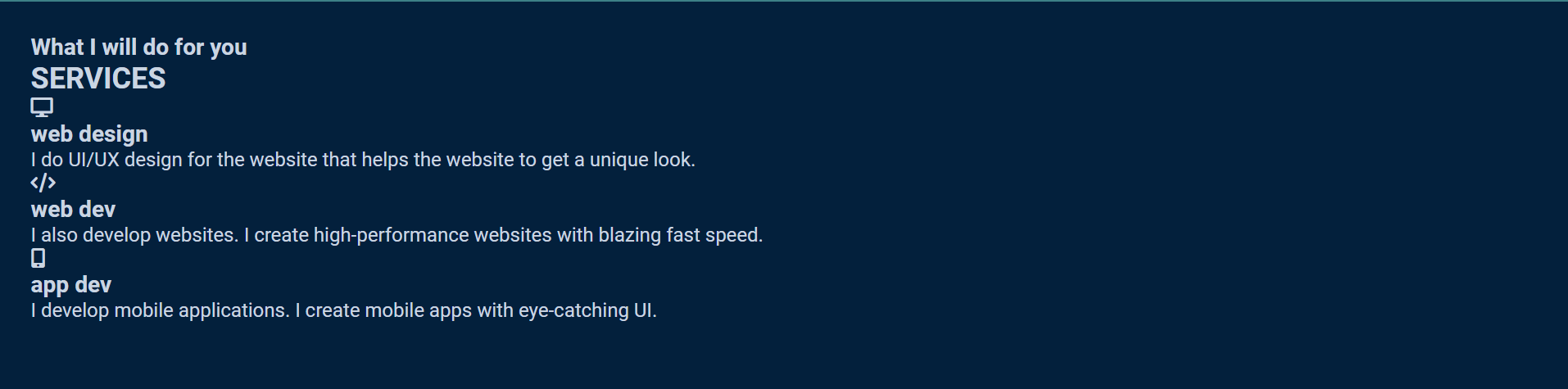
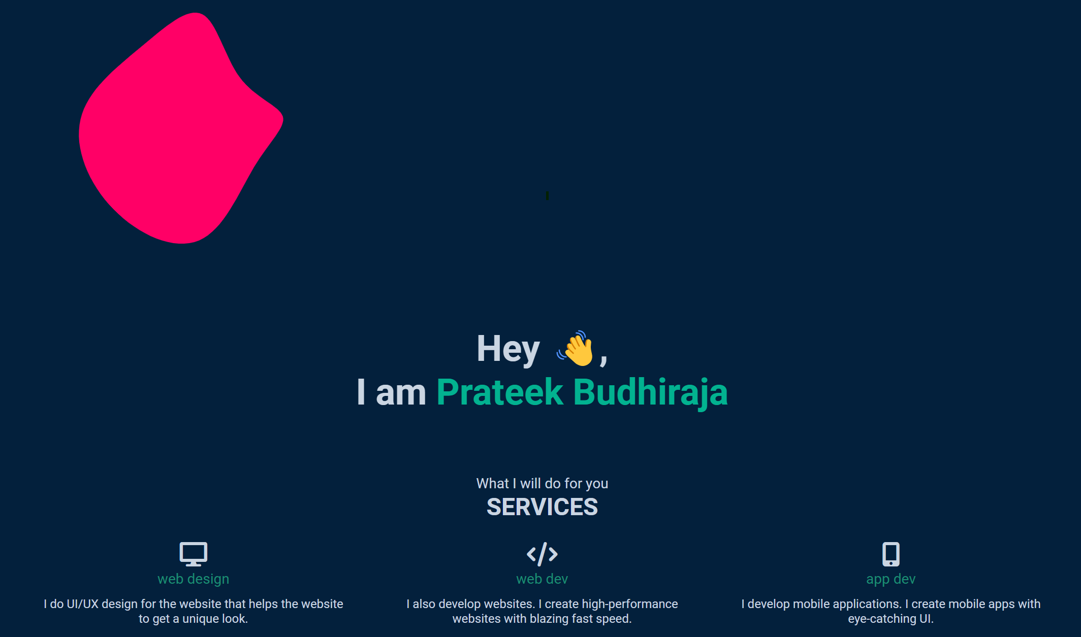
Let's say you want to design a services section and you would like to display the services next to each other.
<div class="services">
    <h3>
      What I will do for you
    </h3>
    <h2>SERVICES</h2>
    <div class="service">
      <i class="fa-solid fa-display"></i>
      <h3>web design</h3>
      <p>I do UI/UX design for the website that helps the website to get a unique look.</p>
    </div>
    <div class="service">
      <i class="fa-solid fa-code"></i>
      <h3>web dev</h3>
      <p>I also develop websites. I create high-performance websites with blazing fast speed.</p>
    </div>
    <div class="service">
      <i class="fa-solid fa-mobile-screen-button"></i>
      <h3>app dev</h3>
      <p>I develop mobile applications. I create mobile apps with eye-catching UI.</p>
    </div>
  </div>
Without positioning the above code would look like this.
But if we add the below CSS it will position the elements one after the other (of course some more for more styling).
.service {
  float: left;
  width: 29.33%;
  margin: 1%;
  padding: 1%;
}
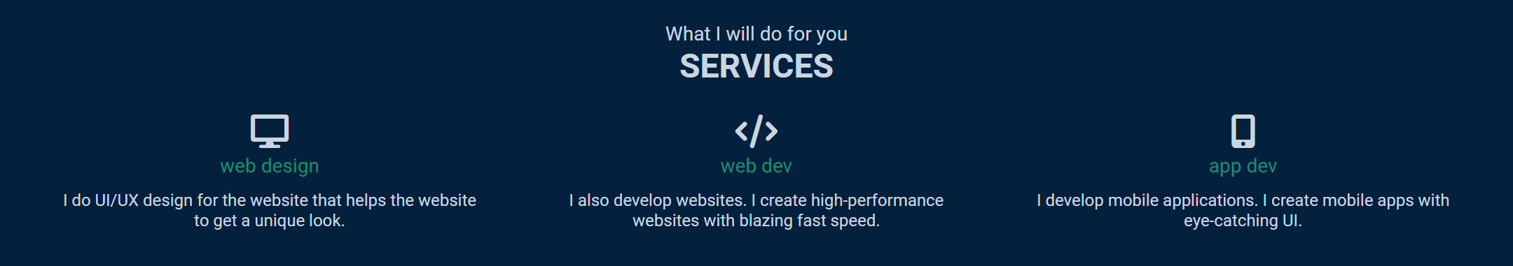
So what the float property does is it removes itself (the element on which it is applied) from the normal document flow, and shifts the element to the left or to the right.

Now as it removes the element from the normal document flow, the elements we try to add below it won't be positioned correctly, so to make sure that other elements won't act unexpectedly, we clear float. This can be achieved by the below code.
.services::after {
  content: "";
  display: block;
  clear: both;
}
It will clear both left and right float. You can read more about it from the link in the resources section below.
Relative and Absolute positioning
With relative poisoning, we position elements relative to their parent element. By this, we can position it by using top, bottom, left and right values.
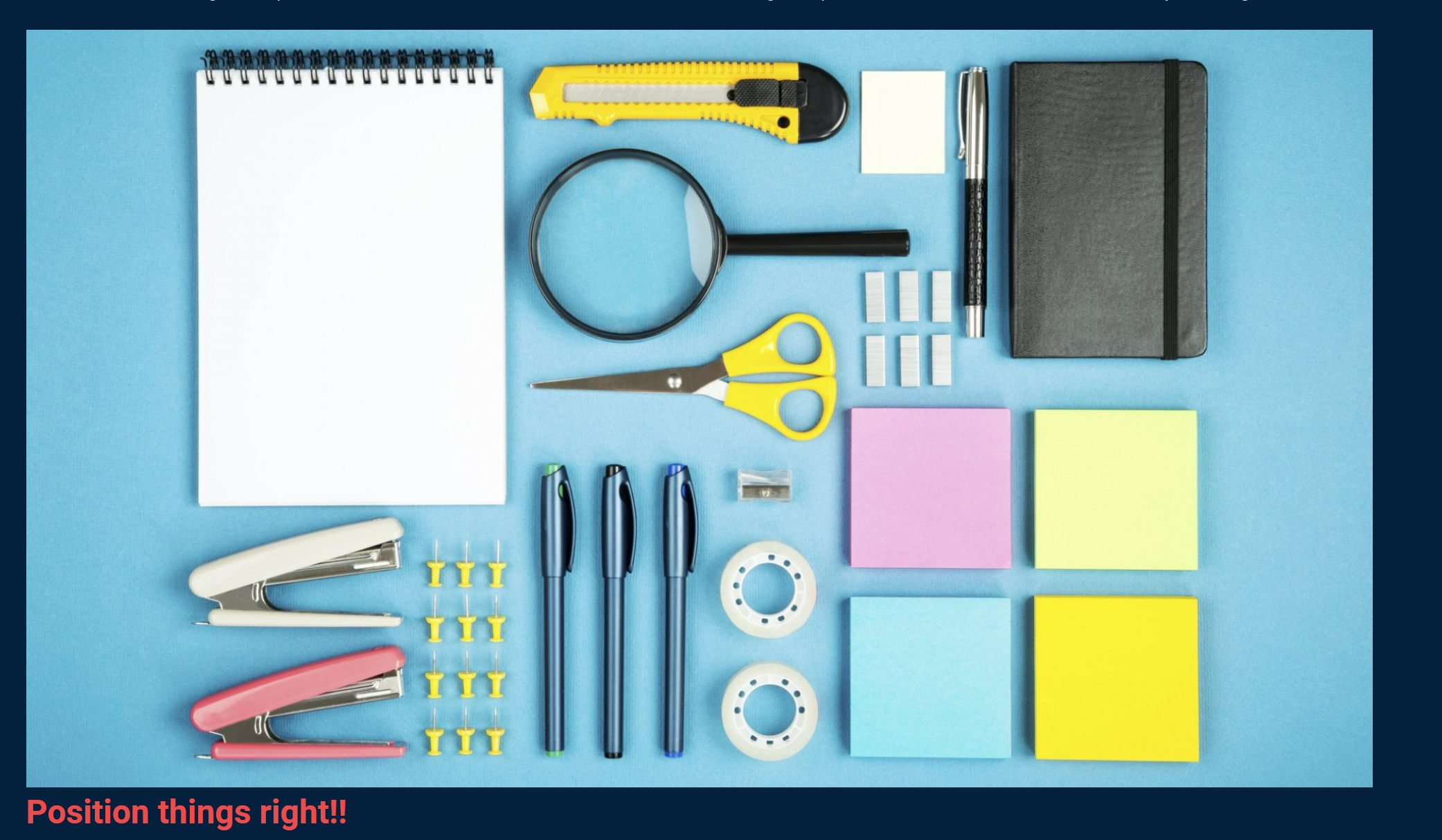
  <div class="position-image">
    <img src="position.jpg" alt="position image">
    <h2>Position things right!!</h2>
  </div>
Now if we need that our <h2> should be on top of the image (we want it to be positioned relative to the image), we can give 'relative' to the <h2> and offset the element from it's current position.
.position-image h2 {
  color: #EB4D4B;
  width: 10%;
  position: relative;
  top: -500px;
  left: 150px;
}
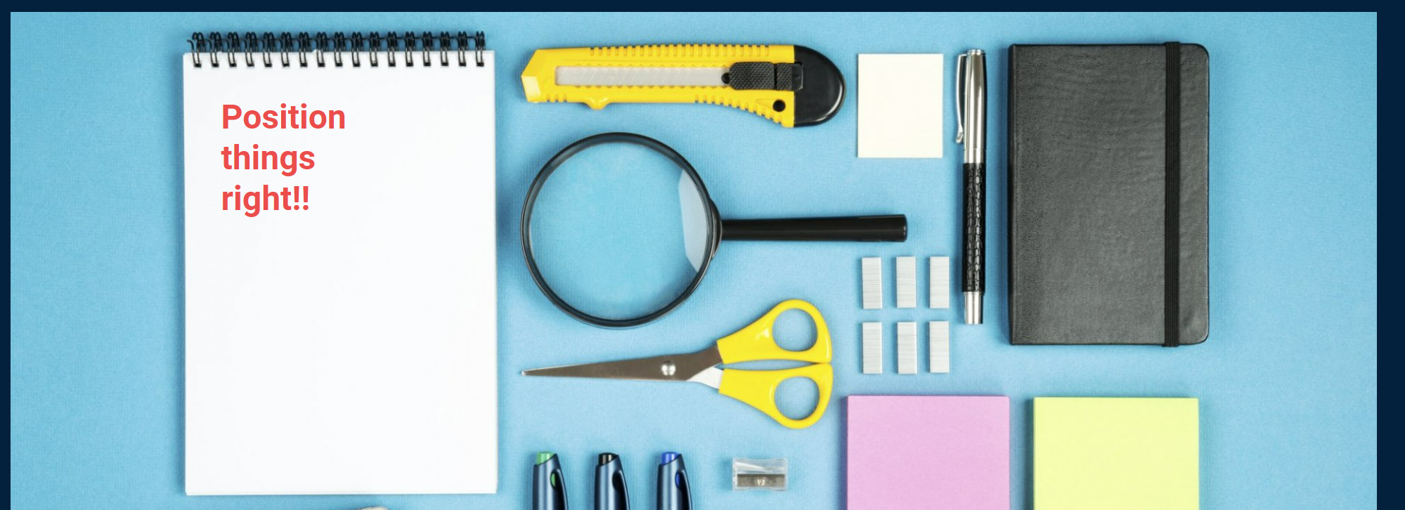
The important thing to note here is that by doing this (using relative), we are not removing it from the normal document flow, we are just offsetting it.
But by using absolute we actually remove that element from the normal document flow! Let's take an example.
We have a blob in the above screenshot and we want to place it behind the name. Let's see how we can achieve it with absolute positioning.
.blob {
  position: absolute;
  top: -200px;
  left: 25%;
}
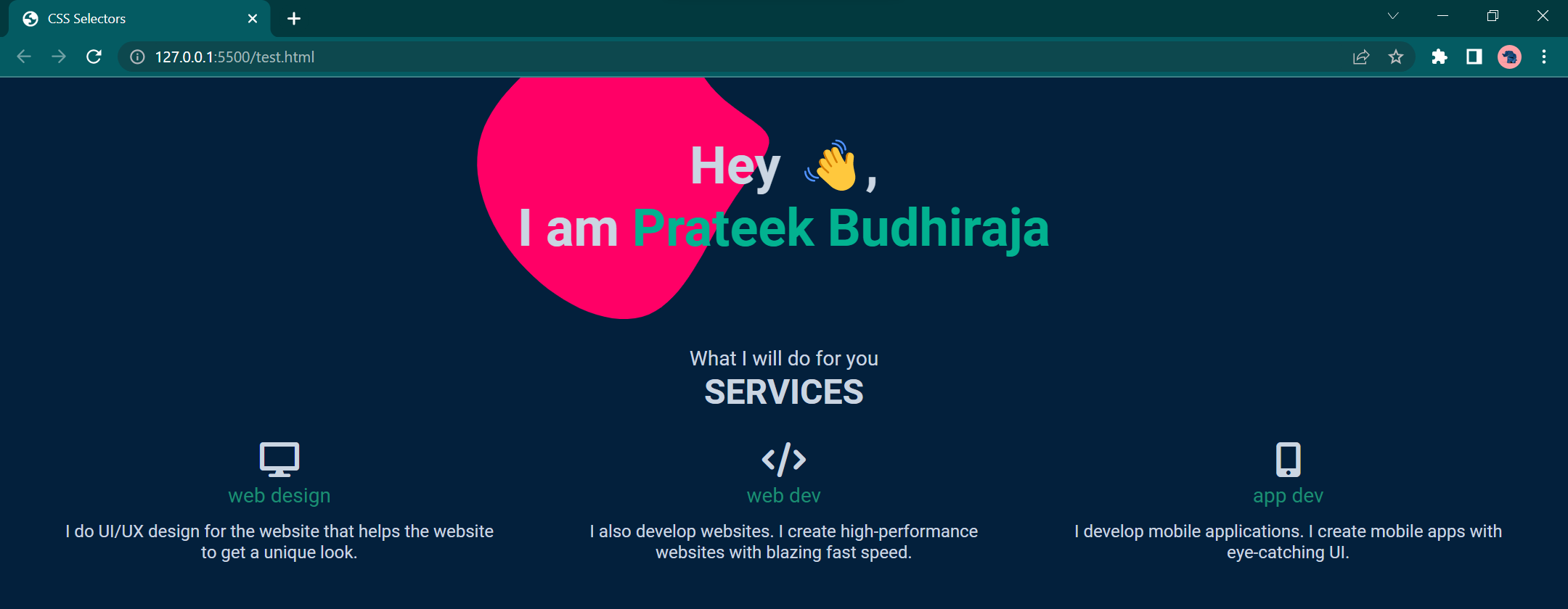
So to summarize in relative the element is positioned relative to its normal position and by doing this we are not disturbing the normal document flow. Whereas in absolute the element is positioned absolutely to its first positioned parent and here we are taking the element out of the normal document flow.
Fixed position
As the name indicates, with fixed property, we can make any element fixed to a certain place and it won't move anywhere with the scroll.
This property also takes the element out of normal document flow. Let's look at a use case.
<div class="gotop">
    <a href="#top"><img src="up-arrow.png" alt=""></a>
</div>
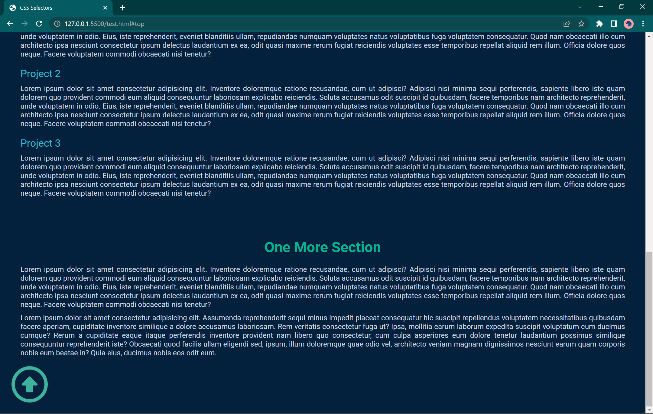
In the above webpage, we want the "Go to top" image to stick to the bottom right of the screen. We can do this with fixed property and by setting bottom and right.
.gotop {
  width: 80px;
  height: 80px;
  position: fixed;
  bottom: 30px;
  right: 20px;
}

.gotop img {
  width: 100%;
}
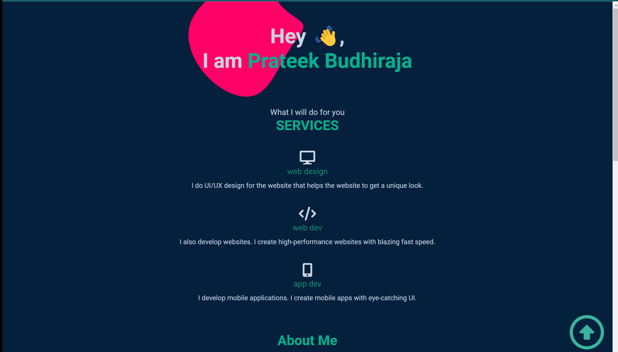
Z Index (Stacking Order)
We have learned about how to position elements the way we want, but what if because of this some of our elements overlap?
The default behaviour is if the element appears first in our HTML file, it would be below the other elements (if applicable)
Now we have a simple nav bar which is fixed, it might go under other elements (the elements which we positioned from CSS) and won't give us what we want. The image below shows the same.
We can solve this by setting a higher z-index value.
nav {
  z-index: 1;
}

In the same way, we can use a negative z-index value to push an element to the background!
That's all about positioning for this blog, I hope you learned something new with this. You can find more resources to read about positioning below.
Happy Learning! ✨