Get Started with Tailwind 🍃
Beginners guide to Tailwind with a small project

🚀 Web Designer and learning full Stack Web development.
What is Tailwind? 🤔
The easiest and the most unhelpful definition would be, that Tailwind is a CSS framework. There you have it, we can now wrap up this blog, thank you for rea... Kidding ;)
You can think of Tailwind CSS as a collection of predefined CSS classes for us to use! It provides an extensive catalogue of utility classes that can be used on the go to develop elegant-looking websites. We can design your webpage with a high degree of customization without ever leaving the HTML file. Not only that, we can write code for media queries inline with that element itself! How cool is that 😃
Now What is a Utility class? 🤦
Utilities are simple HTML classes typically scoped to a single CSS property, like border-style or background-color. These classes are named intuitively, with that anyone can easily understand what that class does. Example: bg-red, text-white you'll know if you apply these classes that you get white text with red background.
Utility first classes can help to reduce style-related headaches in the development process and drastically reduce the development time.
But how will I know to get a red background I have to use the class
bg-redand notbackground-redorbg-gryffindor?
Some of the important ones will be discussed in this blog, if you want to learn more, you can always refer to the Tailwind docs. But here we'll go through how to get started with Tailwind and what are some of the utility classes that should be in our quiver.

Let's start by adding Tailwind to our project 🚀
➡️ Including Tailwind into Our Project
There are many methods to include Tailwind CSS in our project, but the easiest way and the best way if you are learning Tailwind is with Tailwind CDN. So we can add the below code in our <head> to have Tailwind start doing its magic 🪄.
<head>
  <!-- Tailwind CDN -->
  <script src="https://cdn.tailwindcss.com"></script>
</head>
➡️ Utility Classes
🟢 Margin and Padding 🌌
Margins and padding are the most used CSS properties of all time, I use them in all my projects, and you must be too, so with Tailwind, we can use m-{} and p-{} for giving margin and padding respectively.
m-2: will apply0.5remmargin to all the sides.my-[20px]: will apply20pxmargins to top and bottom (y-axis).px-2: will apply0.5rempadding to left and right side (x-axis).pb-[10px]: will apply10pxpadding to the bottom.
And the same way we have mt/pt-{} (margin/padding top), ml/pl-{} (margin/padding left), etc.
<button class="py-2 px-4">Click Me</button>
You can read more about margin and padding
🟢 Colors 🏳️🌈
We get many predefined shades of colors with Tailwind, but we can also configure our own colors for the project (a guide to that would come later in this blog).
These and many more are predefined 👇
bg-blackbg-transparentbg-gray-900: darker shade of greytext-grey-200: lighter shade of greytext-whitetext-red-200
You can check the extensive list of colors from the Tailwind docs.
🟢 Width and Height 🤏
Width and Height are even simpler, we just need to use w-{} for setting width and h-{} to set height. We also have an option to set max-width and max-height, you can explore more about it here.
🟢 Typography 🔠
We'll play with this a lot, and the classes in this are also very intuitive.
uppercase,lowercase,capitalize: for text transformation.text-sm,text-lg,text-2xl,text-6xl: for font size.font-thin,font-normal,font-medium,font-bold: for font weightstext-left,text-center,text-justify: for text alignments

➡️ Handling Hover Effects 🥴
We can also define hover changes right inside our HTML element, we just need to add hover:{} inside our class="". Some examples:
<button class="... hover:bg-sky-300">Click Me</button>
<div class="... hover:text-2xl hover:text-white">
<!-- 👆 notice different hover:{} for every change we want over hover 👆-->
  ...
</div>
It will be clear once we jump onto the project!

➡️ Fixing Layouts 🗃️
Layouts are one of the most important concepts in Web designing. If you are unfamiliar with flex and grid, you can check out my previous blogs for that, if you already know it, implementing it in Tailwind is just about adding some keywords in the class attribute.
flex: is like sayingdisplay: flexflex-wrapflex-colflex-row-reversegrid: is like sayingdisplay: gridgrid-cols-6col-span-2
➡️ Understanding responsiveness 👯
Here things get a little interesting, with tailwind we can define what should happen to the webpage when we move to different screen sizes, and we can define breakpoints on which different utility classes can kick in. If we won't define, there are predefined breakpoints available from Tailwind.
The most important thing to note here is that Tailwind is a mobile-first framework. Repeat after me - Tailwind is mobile first framework!
What does that mean?
It simply means that the styles we write should first look good on mobile!
Can you make it more complicated?
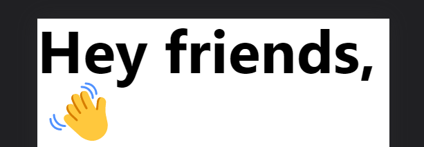
🥲... Okay, let's take an example. Tell me what the below code would do.
<h1 class="text-left text-6xl font-bold">Hey friends, 👋</h1>
This will do this of course 👇
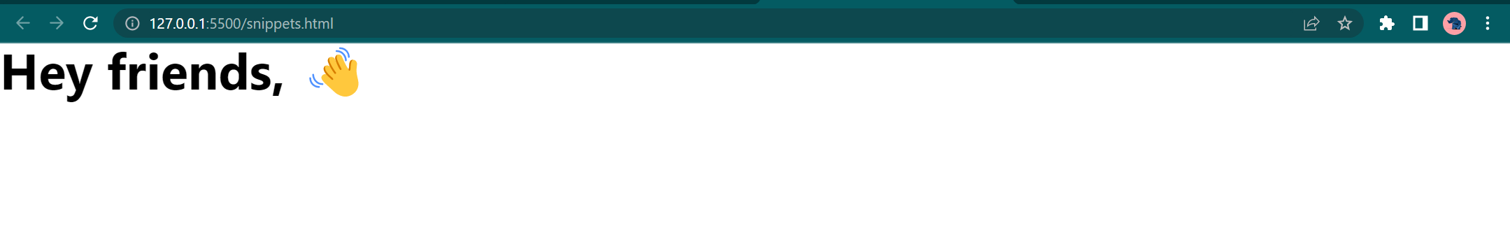
But that doesn't look good on mobile.
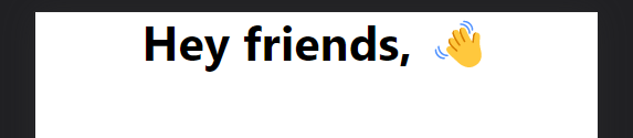
As I said at the start, first think about mobile design as Tailwind is a mobile-first framework. So how you should approach it is 👇
<h1 class="text-center text-3xl font-bold">Hey friends, 👋</h1>
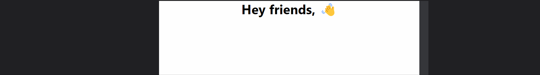
Now when we are satisfied with how it is looking on mobile, we can set breakpoints for things to change on different screen sizes with sm:{}, md:{}, etc. Example:
<h1 class="text-center md:text-left text-3xl sm:text-4xl md:text-6xl font-bold">
  Hey friends, 👋
</h1>
Let's break everything down one by one
text-center: center text on all screens (if on some wider screen it is not overridden).md:text-left: on screens greater thanmedium, make text left aligned.text-3xl: set font size to1.875rem(if on some wider screen it is not overridden).sm:text-4xl: set font size to2.25remon smaller screens and above.md:text-6xl: set font size to3.75remon medium screens and above.font-bold: set font bold on every screen.
So we first applied text-3xl to all the screens but sm:text-4xl will override it, so on screens smaller than configured sm text-3xl will be applicable and on screens greater than sm's configured width text-4xl will be applicable. The same is the case with md:text-6xl.
So in all,
- on screens
0pxtosm->text-3xl - on screens
smtomd->text-4xl - on screens
mdand above ->text-6xl
I hope that cleared any doubts, so we'll get this output 👇
➡️ Customizing configurations
We can customise quite a lot of things in CSS, but below is an example of customizing colors and screen sizes.
We have to override tailwind.config inside a <script></script> which should be inside our <head></head>.
<script>
    tailwind.config = {
      theme: {
        extend: {
          colors: {
           <!-- write custom colors here -->
            bgWhite: '#F5F7FA',
            primaryLightBlue: '#00BAF2',
            primaryDarkBlue: '#0F4A8A',
            secondaryLightBlue: "#66D6FF",
            bgLightBlue: '#F0FBFF',
            hoverLightBlue: "#0098c7",
            hoverDarkBlue: "#0b3663",
          },
          screens: {
           <!-- write custom screens here -->
            'xs': '480px',
            'sm': '700px',
            'md': '1260px',
            'lg': '1400px',
          },
        }
      }
    }
  </script>
So for screen sizes, we can simply use it like we were using it before i.e. sm:{} or md:{}
and for the colors, we can use them like we were using predeclared colors i.e. bg-bgWhite or text-primaryDarkBlue
Project Time 💻
We'll create a small section of our website with Tailwind using everything we learned so far, and if you have read this far, I promise, you'll understand all the classes I used 🤥

Structuring our Nav with HTML 🐫
So in the desktop 🖥️ view, we need a logo at the very left, and then in the center we need three nav links and at the very end, we need two buttons for login and signup.
In the mobile 📱 view, we need a hamburger menu at the very left (which can later have all the nav links) and in the center comes our logo and at the very end, we'll have an account icon.
Let's start building
<head>
  <title>Kitty | Tailwind</title>

  <!-- Font -->
  <link rel="preconnect" href="https://fonts.googleapis.com">
  <link rel="preconnect" href="https://fonts.gstatic.com" crossorigin>
  <link href="https://fonts.googleapis.com/css2?family=Cedarville+Cursive&display=swap" rel="stylesheet">

</head>
<body>

  <!-- NavBar -->
  <nav>

    <!-- Hamburger Menu SVG -->
    <svg xmlns="http://www.w3.org/2000/svg" width="30" height="30" fill="currentColor" class="bi bi-list"
      viewBox="0 0 16 16">
      <path fill-rule="evenodd"
        d="M2.5 12a.5.5 0 0 1 .5-.5h10a.5.5 0 0 1 0 1H3a.5.5 0 0 1-.5-.5zm0-4a.5.5 0 0 1 .5-.5h10a.5.5 0 0 1 0 1H3a.5.5 0 0 1-.5-.5zm0-4a.5.5 0 0 1 .5-.5h10a.5.5 0 0 1 0 1H3a.5.5 0 0 1-.5-.5z" />
    </svg>

    <!-- LOGO -->
    <span style="font-family: 'Cedarville Cursive', cursive;">Kitty</span>

    <!-- Nav Links -->
    <span>
      <span>😋 Food</span>
      <span>🪀 Toys</span>
      <span>🎥 Shows</span>
    </span>

    <!-- Buttons -->
    <span>
      <span>
          <a href="#">Sign up</a>
      </span>
      <span>
          <a href="#">Log in</a>
      </span>
    </span>

    <!-- Account Icon -->
    <svg xmlns="http://www.w3.org/2000/svg" width="30" height="30" fill="currentColor" class="bi bi-person-circle"
      viewBox="0 0 16 16">
      <path d="M11 6a3 3 0 1 1-6 0 3 3 0 0 1 6 0z" />
      <path fill-rule="evenodd"
        d="M0 8a8 8 0 1 1 16 0A8 8 0 0 1 0 8zm8-7a7 7 0 0 0-5.468 11.37C3.242 11.226 4.805 10 8 10s4.757 1.225 5.468 2.37A7 7 0 0 0 8 1z" />
    </svg>
  </nav>
</body>
With this, we got an ugly-looking navbar 👇

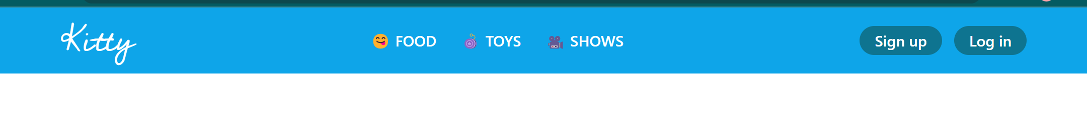
Let's use Tailwind and make it look beautiful 🌈
We'll just use the classes that we learned above and will try to make it look decent.
<head>
<title>Kitty | Tailwind</title>
<!-- Tailwind CDN -->
<script src="https://cdn.tailwindcss.com"></script>
<!-- Font -->
<link rel="preconnect" href="https://fonts.googleapis.com">
<link rel="preconnect" href="https://fonts.gstatic.com" crossorigin>
<link href="https://fonts.googleapis.com/css2?family=Cedarville+Cursive&display=swap" rel="stylesheet">
</head>
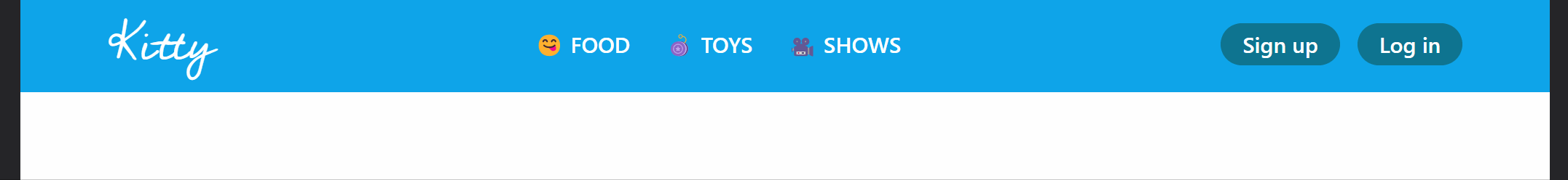
<body class="font-sans">
<!-- NavBar -->
<nav class="bg-sky-500 text-white py-3 md:py-5 px-5 md:px-[80px] flex items-center text-xl justify-between">
<!-- Ham menu icon -->
<svg xmlns="http://www.w3.org/2000/svg" width="30" height="30" fill="currentColor"
class="bi bi-list md:hidden cursor-pointer" viewBox="0 0 16 16">
<path fill-rule="evenodd"
d="M2.5 12a.5.5 0 0 1 .5-.5h10a.5.5 0 0 1 0 1H3a.5.5 0 0 1-.5-.5zm0-4a.5.5 0 0 1 .5-.5h10a.5.5 0 0 1 0 1H3a.5.5 0 0 1-.5-.5zm0-4a.5.5 0 0 1 .5-.5h10a.5.5 0 0 1 0 1H3a.5.5 0 0 1-.5-.5z" />
</svg>
<!-- Logo -->
<span style="font-family: 'Cedarville Cursive', cursive;" class="text-5xl text-white">
Kitty
</span>
<!-- Nav Links -->
<span class="md:flex gap-8 hidden">
<span class="font-semibold cursor-pointer uppercase hover:text-stone-700">
😋 Food
</span>
<span class="font-semibold cursor-pointer uppercase hover:text-stone-700">
🪀 Toys
</span>
<span class="font-semibold cursor-pointer uppercase hover:text-stone-700">
🎥 Shows
</span>
</span>
<!-- Buttons -->
<span class="hidden md:flex gap-4">
<span>
<a href="#" class="bg-cyan-700 font-medium hover:bg-cyan-900 py-1.5 px-5 rounded-full">
Sign up
</a>
</span>
<span>
<a href="#" class="bg-cyan-700 font-medium hover:bg-cyan-900 py-1.5 px-5 rounded-full">
Log in
</a>
</span>
</span>
<!-- Account Icon -->
<svg xmlns="http://www.w3.org/2000/svg" width="30" height="30" fill="currentColor"
class="bi bi-person-circle md:hidden cursor-pointer" viewBox="0 0 16 16">
<path d="M11 6a3 3 0 1 1-6 0 3 3 0 0 1 6 0z" />
<path fill-rule="evenodd"
d="M0 8a8 8 0 1 1 16 0A8 8 0 0 1 0 8zm8-7a7 7 0 0 0-5.468 11.37C3.242 11.226 4.805 10 8 10s4.757 1.225 5.468 2.37A7 7 0 0 0 8 1z" />
</svg>
</nav>
</body>
This is the end result ⛱️

What to do after this?
You can now directly jump onto creating projects, you can recreate any of your old projects made in vanilla CSS or you can also create clones of any of your favourite websites! You of course won't remember the class names at the start, but docs are there for a reason. You are supposed to refer to official docs whenever you want to search how something happens in tailwind!
Here are my projects in Tailwind for inspiration:
I hope you learned something new, if you want to play with the code, you can access it here. And if you happen to create something with Tailwind (or extend upon what we created in this blog), you can share the code link with me in the comments. I would love to see those!
Cat says Happy Learning! 🌈